
Sports analytics is frequently carried out by numerous National Basketball Association (NBA) franchises and teams in other sports. Technology called “Player Tracking,” [1] is used by NBA teams to evaluate player movement. The data collected provides statistics on a number of metrics including speed, distance, player separation and ball possession. The device can track how fast a player moves, how many times he touched the ball, how many passes he made etc. The results are normally used for tactical purposes to either gain further insights into performances of opposition players, to track the performance of the club’s own players or to determine if a player is worth drafting to the club. As basketball players get older, their performance levels tend to drop and may need to be monitored more carefully to help coaches get the best out of the player by altering their workload or playing position.
The data source for this report was selected from an educational competition hosted by Kaggle [2] and is freely available to the general public. The data was wrangled from the statistics section on the NBA website [4] and consists of 20 years of data collected from shots made by one of the greatest NBA players, Kobe Bryant, who recently retired from the Los Angeles Lakers in April 2016.
Analytical Questions
In basketball, many factors affect the performance of a player and his shot accuracy during a game. These include location of the shot, shot type (jump shot, slam dunk, pick and roll etc.), time remaining in the game, player skill level, age of the player and how injury prone the player is [3, 4, 5]. To answer the overall research question in this paper: “How does Kobe Bryant’s performance vary through his 20 year career?”, we need to consider different aspects of his playing career. This leads to the formulation of the following analytical questions:
- Does Kobe preferentially perform better (shoot more and score more) at certain zones/locations on the court?
- Does Kobe Bryant shoot at different distances from the basket as he progresses through his career, due to experience or other factors
- How does Kobe Bryant’s accuracy vary across different seasons of his 20 year career?
- Does Kobe Bryant have more of an impact when there are fewer minutes on the clock i.e. when there is more pressure to score shots
- Is it possible to accurately predict the probability of a shot given the pattern of Kobe’s shots history?
- Could the results be used to help coaches improve their tactics when managing Kobe?
The next section discusses the analytics strategy used in this paper to gain insights from the data to answer these analytical questions.
Data Wrangling and Initial Investigation
The dataset contains over 30,000 observations and 25 attributes, some of which include shot type, shot distance, spatial coordinates for shots made, opponent, season, minutes remaining when shot was made and a binary “shot made” flag which is the label for the dataset indicating whether a shot was made or missed.Seven columns which provide no benefit for the data analysis process are dropped e.g. Team ID, game event ID, game ID etc. These also included redundant measures e.g. ‘matchup’ which correlated with another column ‘opponent’. A couple of the features also include coordinates for spatial locations where Kobe shot the ball from. As a first step in the exploratory analysis process, a spatial plot of the total shots scored from different locations on the court is illustrated in the plots below.
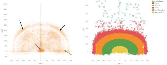
Coordinate (0,0) corresponds to the location of the basket. The court can also be split into different zones which are used by coaches for tactical purposes. The right spatial plot of shot zone regions are colour coded by distance ranges from the basket: less than 8ft, 8-16ft, 16-24ft, 24+ft, and shots from the back court. In the left figure, there are a high density of shots close to the basket and along the free throw line (blue arrow), where Kobe was known to score most of his points during offensive moves. In addition, a lower density of points can be seen at the right and left center parts of the court (black arrows), just beyond the three-point line (boundary of orange and red region in right figure) and along the restricted area (green arrow).
A dual boxplot generated in Tableau is shown below illustrating the total shots scored and the percentage of shots scored for each season of Kobe Bryant’s 20 year career.
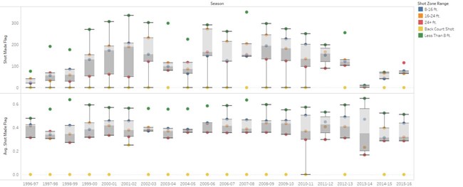
He shows a clear preference for shooting closer to the basket (less than 8ft) with higher accuracy for majority of his career up until the 2013-2014 season. These are represented by the green outliers in both boxplots. The yellow outliers represent shots made from the back court which Kobe hardly attempted as there is a very slim chance of scoring. As Kobe Bryant aged, he showed an increased preference to the long distance shots (24 feet from the basket or beyond the 3 point line). For his final season (2015-2016), he attempted far more shots from beyond a 24 feet range (red dot) which is inevitable as his speed and agility decreased with age. However, interestingly he was less successful in scoring these shots compared to the shots made at less than 8ft (green dot). We can also see an interesting pattern developing from the 2013 season onwards, where he makes considerably less shots.
The histogram of total shots (and shot accuracy colour coded) made at different distances shows a sharp peak at very small distances close to the rim, a broader peak at mid-range distances and a narrower peak at larger distances away from the rim. This also verifies Kobe’s preference for shooting closer to the rim and also achieving a high shot accuracy (red bar). His accuracy then drops off (green) but is still consistent up to 25 ft from the basket (3-point line) after which it tails off (light blue).
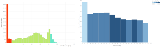
The plot below illustrates how much of an impact Kobe has at different times of a 12 minute game quarter. He tends to be more successful during the middle of the quarter (dark blue bars) compared to the last minutes of the quarter where he attempts more shots but has a relatively poorer accuracy.
Dimensionality Reduction
The next stage in the analysis would be to investigate whether the dimensions in the dataset can be reduced to remove variables which are highly correlated to improve model performance in the next stage in the analysis process. Principal Component Analysis (PCA) [6] [10] is one such technique which transforms the original variables into new variables called principal components (normalized linear combinations of the original predictors in the dataset). The first component captures the maximum variance in the dataset whilst the second component which is orthogonal to the first (since it is uncorrelated with the first component) should capture some of the remaining variance. This technique primarily works with variables containing continuous numerical values. Three of our remaining features contain numerical continuous values and the remaining categorical, so we will only consider these three features. Another dimensionality reduction technique called Multiple Correspondence Analysis (MCA) [7] can be used to find associations between categorical variables by displaying the data on a 2d or 3d plot and hence reducing the number of columns in the dataset for the final analysis. However, this has not been applied in this analysis as all categorical variables are deemed to be important (due to my considerable knowledge of basketball gameplay) for building the model for shot prediction. The first step is to standardise the original dataset so the features have zero mean and unit variance. Alternatively, the features can be scaled to lie between zero and one. This is important before performing PCA as non-standardised variables can lead to large loadings for variables with high variance. The principal components will then be preferentially dependent on the variables with high loadings which can skew the results [6]. Standardisation is also an important step before the implementing any machine learning algorithms in the scikit- learn library in Python as performance may be affected if the individual features are not scaled.
1
2
3
4
5
6
7
8
9
10
11
12
13
14
15
16
17
18
19
20
21
22
23
24
25
26
27
28
29
30
31
32
33
34
35
36
37
38
39
40
41
42
43
44
45
46
47
48
49
50

from sklearn.decomposition.pca import PCA
from sklearn import preprocessing
import numpy as np
import matplotlib.pyplot as plt

data_PCA = data.values
train_PCA = data_PCA[:,[1,4,5]] # using only the first five columns for PCA i.e. non
pca = PCA(n_components=3) # the components are mins remaining, period, season,seconds remaining and shot distance

 # scaling the columns so they all have the same range then normalisaing by z-score transformation befor PCA
scaler_PCA = preprocessing.StandardScaler().fit(train_PCA)
PCA_scaled = scaler_PCA.transform(train_PCA)
pca.fit(PCA_scaled)
projectedAxes = pca.transform(PCA_scaled)

varianceratio = pca.explained_variance_ratio_
print(' ')
print(pca.explained_variance_ratio_) # prints array with componets with highest variance ratio in descending order
print(' ')


sum(varianceratio[0:-1]); #the first 4 components account for only 83% of the total variance so dimensionality reduction may results in loss of information and affect mdoel performance

train_PCA_cumsum_var = np.cumsum(np.round(pca.explained_variance_ratio_, decimals=4)*100)

print(' ')
print(train_PCA_cumsum_var)
print(' ')

with plt.style.context('seaborn-whitegrid'):
    plt.figure(4)

plt.bar(range(len(varianceratio)), (100*varianceratio), alpha=0.5, align='center',
label='individual explained variance')
plt.step(range(len(train_PCA_cumsum_var)), (train_PCA_cumsum_var), where='mid',
label='cumulative explained variance')
plt.title('Bar chart of explained variance ratio for individual components and Cumulative explained variance')
plt.ylabel('Explained variance ratio')
plt.xlabel('Principal components')
plt.legend(loc='best')

# we see that each attribute contributes roughly 20% of the variance in the data are are almost equally important. So we will use all 5 features for the subsequent modelling steps

plt.figure(5)
plt.scatter(projectedAxes[:,0], projectedAxes[:,1],marker = 'o', c =(1,0,0),s =50, alpha =0.4)
plt.title("Scatter plot PC1 vs PC2")
plt.xlabel("PC 1 ")
plt.ylabel("PC 2")
Following dimensionality reduction using the decomposition module in scikit-learn, a pareto plot of the 3 components is produced in the figure below, illustrating how much variance is accounted for by each component.
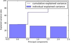
The percentage variance was roughly equally divided among the three components, although the first component accounted for slightly larger variation in the dataset (38% variance). Selecting the first two components would only account for 70% of the total variance in the dataset which would result in a significant loss of information and subsequently affect model performance.
The scatter plot of principal component 1 and 2 in the figure below shows a roughly symmetrical distribution in space with the points slightly more distributed along the first principal component PC1 (long thin tail) as expected.
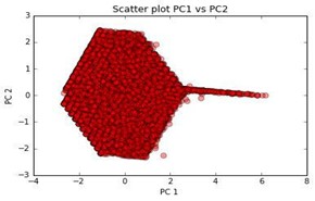
Dimensionality reduction could potentially result in a significant loss of information in this case. Hence all 3 original numerical features will be used for training models described above.
Modelling and Validation of Results
The primary goal is to predict shot success using the following inputs: shot distance, minutes remaining in the period, second remaining, shot zone area, shot type, type of field goal scored (2 pointer or 3 pointer). Most of these features except for shot type and type of field goal are numerical inputs. One hot encoding [6] was used for transforming categorical variables into a format which works better when running classification algorithms. Each category is converted into a separate Boolean column where each sample in the column can now only take on a value 1 or 0. The dataset was then randomly split into training and test data using 80/20 split. Random forests [8] are an ensemble learning algorithm that operate by fitting a number of decision tree classifiers on sub sets of the dataset. Individual trees tend to overfit training data i.e. have a low bias but very high variance. Random Forests on the other hand train decision trees on different parts of the training set. By doing this, it averages across multiple decision trees thereby with a slight increase in bias but reducing the overall variance compared to a single tree. This has the effect of boosting the overall accuracy and performance of the model.
An exhaustive grid search [6] with k fold cross validation (k = 10 folds) was used to tune the Random Forest classifier which considers all parameter combinations from a grid of parameter values specified by the user. The parameters tuned were the number of trees [90], criterion for splitting [‘gini’, ‘entropy’], max tree depth [1, 3, 10], minimum samples for split [1][3][10], minimum sample leaf [1][3][10]. The mean validation score was calculated to be 0.68 ± 0.006 by averaging across the error of all folds.
1
2
3
4
5
6
7
8
9
10
11
12
13
14
15
16
17
18
19
20
21
22
23
24
25
26
27
28
29
30
31
32
33
34
35
36
37
38
39
40
41
42
import pandas as pd
from sklearn.model_selection import train_test_split
from sklearn.model_selection import GridSearchCV
from sklearn import ensemble
from sklearn import preprocessing

data = data.drop(['shot_made_flag','combined_shot_type','lat','loc_x', 'loc_y', 'lon','shot_id'], axis =1)
categories = ['shot_type','opponent','shot_zone_area','shot_zone_basic','shot_zone_range','season','period', 'action_type']
one_hot = pd.get_dummies(data[categories])
data_noncategory = data.drop(categories, axis=1)
data_one_hot = data_noncategory.join(one_hot)
scaler = preprocessing.StandardScaler().fit(data_one_hot)
data_scaled = scaler.transform(data_one_hot)


X_train, X_test, y_train, y_test = train_test_split(data_scaled, label, test_size=0.3, random_state=42)

forest = ensemble.ExtraTreesClassifier()
# use a full grid over all parameters
param_grid = {"n_estimators":[90],
              "max_depth": [1,3,10],
              "max_features": [113],
              "min_samples_split": [1, 3, 10],
              "min_samples_leaf": [1, 3, 10],
              "bootstrap": [True, False],
              "criterion": ["gini", "entropy"]}

# run grid search
grid_search = GridSearchCV(forest, param_grid=param_grid, cv= 10)
start = time()
grid_search.fit(X_train, y_train)

print("GridSearchCV took %.2f seconds for %d candidate parameter settings."
      % (time() - start, len(grid_search.cv_results_['params'])))
report(grid_search.cv_results_)
print ''
print 'A summary of the grid search:'
print grid_search.cv_results_
print ''
print 'The best estimator from the grid search was %s and corresponding score is %.2f' %(grid_search.best_estimator_ , grid_search.best_score_)
print grid_search.best_params_
The parameters for the best estimator (with the lowest log loss) were: [minimum samples at each leaf node: 10, number of trees: 90, minimum samples to split an internal node: 10, splitting criterion: ‘gini’, maximum depth: 10]. These were chosen to re-train the random forest classifier. The accuracy on the test set was reported as 0.68.
1
2
3
4
5
6
7
8
9
10
11
12
13
14
15
16
17
from sklearn.metrics import f1_score
from sklearn import ensemble
from sklearn.metrics import roc_auc_score

forest = ensemble.ExtraTreesClassifier(bootstrap= True, min_samples_leaf=  10, n_estimators=  90, min_samples_split= 10, criterion = 'gini', max_features= 113, max_depth= 10, random_state =42)

forest.fit(X_train,y_train)
y_pred = forest.predict(X_test)
result = forest.score(X_test, y_test)
print ''
print "The test accuracy is %.2f" % result
print ''
print "AUC-ROC:",roc_auc_score(y_test,y_pred)
print ''
f1score = f1_score(y_test, y_pred, average = 'weighted')
print "the F1 score is %.2f:" % f1score
print ''
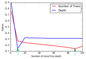
The plot shows the effect of increasing the number of trees and tree depth on the logarithmic loss (computed according to the definition on the Kaggle website) [11]. As number of trees are increased from 1 to 100, a relatively sharp reduction in the logarithmic loss is seen at 10 followed by a gradual improvement in accuracy. For the tree depth, a relatively big improvement in accuracy is seen at a depth of 10, followed by small sharp increase up to 20, after which any further increase in parameter value has minimal impact on accuracy. The optimal values for number of trees and depth are chosen where there is a dip in the plots (green arrows) at 10 and 90 respectively.
The model performance can be evaluated by numerous classification metrics, the choice of which are very important. The most common being the classification accuracy which is the ratio of correct prediction made, as reported above [10]. However, this assumes a perfect class balance which is not the case in this dataset. Alternative metrics, include the confusion matrix, logarithmic loss and Receiver Operator Characteristic curve [6,10].
1
2
3
4
5
6
7
8
9
10
11
12
13
14
15
16
17
18
19
20
21
22
23
24
25

from sklearn.metrics import confusion_matrix
import matplotlib.pyplot as plt

def plot_confusion_matrix(cm, classes,
                          normalize=False,
                          title='Confusion matrix',
                          cmap=plt.cm.Blues):
    """
    This function prints and plots the confusion matrix without mormalisation.
    """
    plt.imshow(cm, interpolation='nearest', cmap=cmap)
    plt.title(title)
    plt.colorbar()
    tick_marks = np.arange(len(classes))
    plt.xticks(tick_marks, classes, rotation=45)
    plt.yticks(tick_marks, classes)

    plt.tight_layout()
    plt.ylabel('True label')
    plt.xlabel('Predicted label')

cnf_matrix = confusion_matrix(y_test,y_pred)
plt.figure()
plot_confusion_matrix(cnf_matrix,classes = label_names, title='Confusion matrix, without normalization')
The confusion matrix shows that the algorithm performed well when predicting the number of missed shots (True negatives: 3639) compared to predicting the number of scored shots (True positives: 1571).
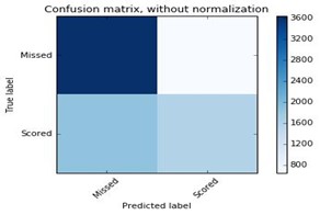
It often misclassified the number of scored shots (False negatives: 1856). In contrast the number of missed shots were misclassified less frequently (False positive: 644). As a result, a lower precision (0.46) and higher recall (0.71) was computed. The weighted F1 score computed in scikit-learn takes into account class imbalance and was computed as 0.66. This was slightly lower but comparable to the test accuracy score listed above.
Findings
The findings from exploratory analysis have shown that Kobe’s performance was very unpredictable during his early years but he then gradually set a very high standard for most of his career, which is evident from the median percentage of field goals he scored. He also preferred scoring closer to the basket. As he aged he attempting more shots further from the basket and close to the three point line. This could signify a change in playing style due to his decrease in athletic ability as he got older. However, his accuracy was still lower
compared to situations when he did attempt a shot closer to the basket showing that even a great player cannot just transform into a long range shooter at a latter point in their career. Following, Kobe’s injury in 2013, it is evident that his median ratio of shots scored decreased drastically up to 2016 when he retired. In the 2015- 2016 season, he showed high unpredictability in his performance as evident from the large range of shot accuracy in the boxplot (almost comparable with the unpredictability he showed at the start of his career). Kobe is also more effective during the middle of a quarter where he scores a higher percentage of field goals. Towards the last few minutes of the quarter, he seems to attempt more shots. This may be due to him taking more responsibility being the star player of the team. However, his shot accuracy is the worse of any other segment of the quarter showing that he either misses a lot of shots or the opposition are able to improve their defensive play against him towards the end of the quarter.
The F1 score of 0.66 for the Random Forest model was reasonable considering the complexity of the dataset and the unpredictable nature of the sport. However, there is definitely room for improvement, especially if this model is to be used by coaches for tactical purposes. Given the limitations with respect to computational speed, the grid search was only run for a narrow range of parameter combinations. This took approximately 64 minutes on an Intel® CoreTM i7-6700 processor (3.5 GHz) with 16GB RAM. Adding more parameters in the grid search and increasing certain parameters like number of trees to 500 or 1000 for example, can significantly increase the computational time to hours or even days. Random Forest is a very powerful and robust model and has been used extensively in a number of data science competitions because of their ability to produce a good stable accuracy with increasing complexity of data. However, other alternatives exist like Gradient Boosting Machines and AdaBoost (belonging to the class of ensemble algorithms) and support vector machines (SVM) [14]. Additionally, a ‘stacking’ approach can be used in the model implementation which uses the predictions of a number of different primary models to train a higher level learner. For example, the predictions of Random Forest, SVM and Gradient Boosting algorithms could be used as inputs to train an Artificial Neural Network. This has proven to achieve better generalisation and accuracy than using single models [14].
We have assumed that the success or failure of the previous shot does have any effect on the next shot going in i.e. all shot attempts are independent of each other. A very debatable phenomenon called ‘the hot hand’ states that if a player goes on a scoring streak, he is more likely to score his next shot i.e. there is a correlation between a player’s previous shot and his next shot. Very early published work in 1985 [12] claimed that the hot hand was a fallacy, and any correlation was likely due to statistical noise. Recently published work in 2014 [13], have argued that ‘hot hands’ are real and players tend to outperform if they go on a ‘hot streak’. To take this into account, it would mean training a model separately on all shots previous to the shot being predicted. Given that 1 out of 6 shots in the dataset were unlabelled (used as test data), this makes it harder to train a model to predict the first few shots made in the test set due to lack of the training data points prior to these shot events. This dataset focuses solely on Kobe Bryant’s historical career. It would also be interesting to compare one of Bryant’s attributes (shooting, passing, accuracy etc.) to other top players e.g. Stephen Curry, Michael Jordan, Lebron James etc. However, these players play in different positions and have different playing styles and strengths. Some are better shooters, some are better at attacking the net whilst others are better rebounders or excel in defensive play. Hence, it would be useful to obtain additional play statistics like number of rebounds, steals, assists etc. to quantify player performance in more ways than just using shot accuracy alone [3][5][9].
References
- [1] A Whole New View: Player tracking article from the stats section of the National Basketball Association website. Retrieved from http://stats.nba.com/featured/whole_new_view_2013_10_29.html
- [2] Kobe Bryant shot selection dataset from Kaggle. Retrieved from https://www.kaggle.com/c/kobe-bryant-shot- selection
- [3] Losada, A.G., Therón, R. and Benito, A., 2016. BKViz: A Basketball Visual Analysis Tool. IEEE Computer Graphics and Applications, 36(6), pp.58-68.
- [4] NBA player and team statistics section from the NBA website. Retrieved from http://stats.nba.com/
- [5] Guerra, Y.D.S., González, J.M.M., Montesdeoca, S.S., Ruiz, D.R., López, N.A. and García-Manso, J.M., 2013. Basketball scoring in NBA games: an example of complexity. Journal of Systems Science and Complexity, 26(1), pp.94-103.
- [6] Pedregosa, F., Varoquaux, G., Gramfort, A., Michel, V., Thirion, B., Grisel, O., Blondel, M., Prettenhofer, P., Weiss, R., Dubourg, V. and Vanderplas, J., 2011. Scikit-learn: Machine learning in Python. Journal of Machine Learning Research, 12(Oct), pp.2825-2830.
- [7] Abdi, H., Valentine, D. (2007). Multiple Correspondence Analysis. Encyclopedia of Measurement and Statistics. pp.651-657
- [8] Breiman, L. (2001). Random forests. Machine learning,45(1), 5-32.
- [9] Haghighat, M., Rastegari, H. and Nourafza, N., 2013. A review of data mining techniques for result prediction in sports. Advances in Computer Science: an International Journal, 2(5), pp.7-12.
- [10] Friedman, J., Hastie, T., Tibshirani, R. (2009). The elements of statistical learning (Vol.1). Springer series in statistics Springer, Berlin.
- [11] Kaggle website Logarithmic Loss definition: https://www.kaggle.com/wiki/LogarithmicLoss
- [12] Gilovich, T., Vallone, R. and Tversky, A., 1985. The hot hand in basketball: On the misperception of random sequences. Cognitive psychology, 17(3), pp.295-314.
- [13] Bocskocsky, A., Ezekowitz, J. and Stein, C., 2014, March. The hot hand: A new approach to an old “fallacy”. In 8th Annual Mit Sloan Sports Analytics Conference
- [14] Wolpert, David H. “Stacked generalization.” Neural networks 5.2 (1992): 241-259.
Comments powered by Disqus.